How about the new version of Win11UI? This chapter mainly introduces the content of the new version of Win11UI. If you don’t understand it yet, please follow the editor to learn about it. I hope it will be helpful to you.
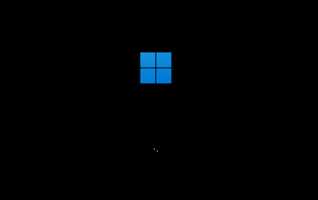
The new version of Win11UI has a new startup logo
Win11 brings a lot of rounded corner UI, and it is reasonable to add many axed Windows10X The interface design, the most significant of which is the centered taskbar and start menu, the dynamic tiles completely disappear, and the start menu uses a new icon.
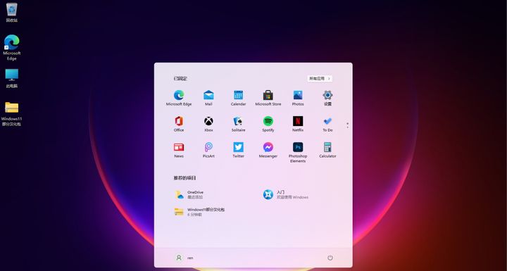
A multi-tasking button is added to the Win11 taskbar, and a blank desktop can be created.
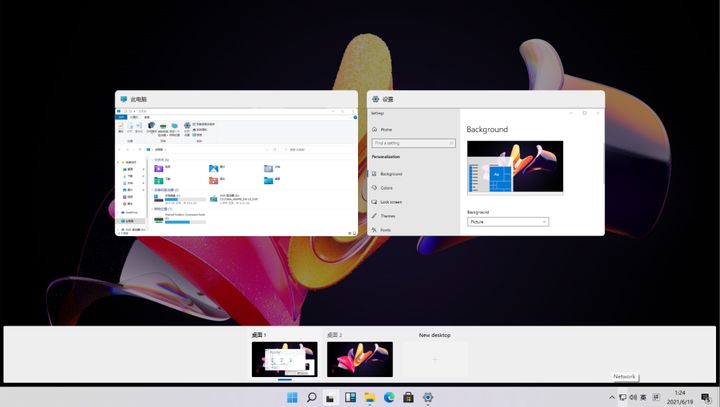
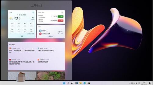
In addition, Win11 has also added a new button on the taskbar - widgets. After opening, widgets will be displayed. What you can currently experience is "News and Interests", which has a bad reputation recently. Compared with Starting from Win7 Widgets of the era, Win11 widgets will be stored in a card interface, and the icons are generally beautiful.
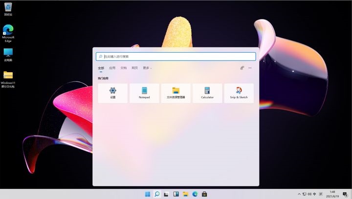
The Win11 search interface has also had a slight layout change, and is suspended above the taskbar in the form of a card.
There are many detailed changes that you can install and experience by yourself. It is recommended to test on a virtual machine, because this version currently has many bugs, and the Chinese adaptation is not very good.
Since it is an English version, you need to manually install the Chinese language pack. Change the region to China.
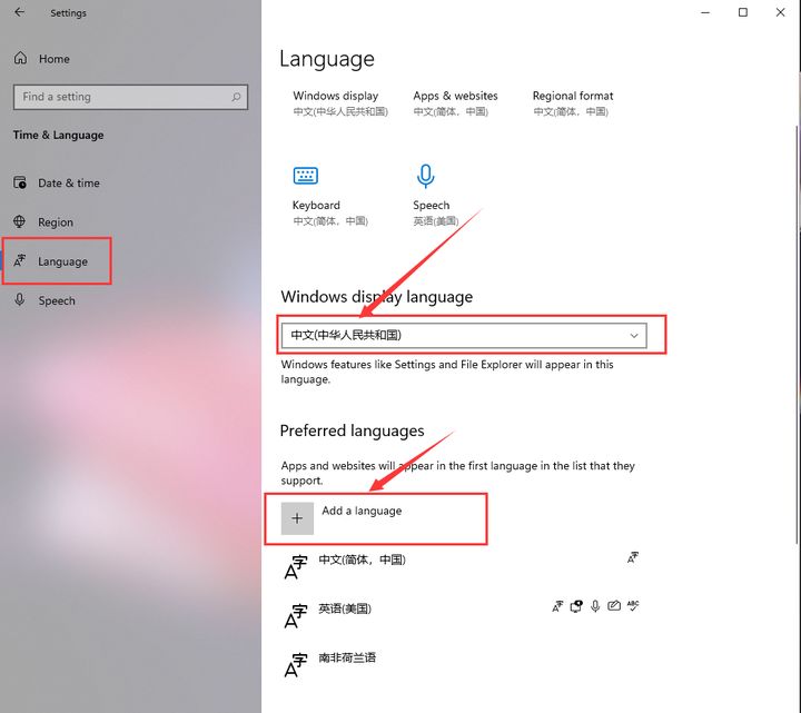
Add Chinese (Simplified, China) in Language, and then log out of the system to get the Chinese system interface.

The above is all the content of the new version of Win11UI brought to you by the editor. I hope it can help you.
