What is the font of Founder Xiaobiao Song Simplified? -What does Fangzheng Xiaobiao Song Simplified Chinese look like?
Time: 2024-12-26Source: InternetAuthor: Qingchen
Founder Xiaobiao SongSimplified Chinese features
1. The font has a high degree of regularity and the overall visual effect is relatively coordinated.
2. The effect it presents is like seal cutting, with bright, clear and natural lines.
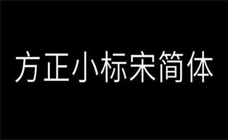
3. Any sizefontThe accuracy is very high, and the layout is clear and concise.
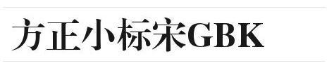
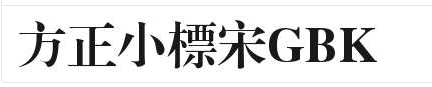
What does the Founder Xiaobiao Song GBK font look like?
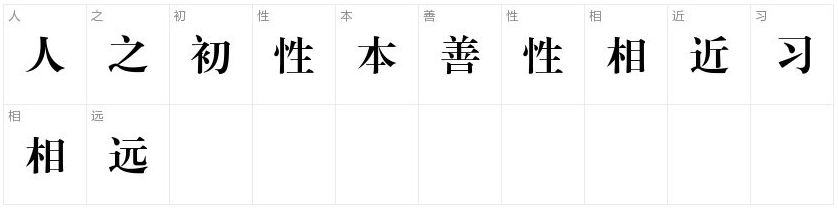
1. Chinese character preview effectSimplified and Traditional Chinese.
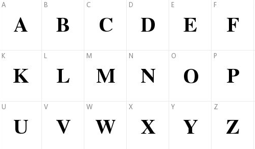
2.upper caseEnglish lettersPreview the effect.
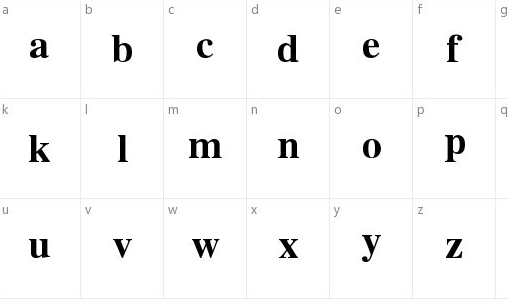
3.lowercaseEnglishtextlettersPreview the effect.
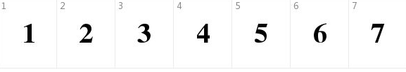
4.digital previeweffect.
The above is all the content about Founder Xiaobiao Song Dynasty. I hope it will be helpful to you.
Popular recommendations
-
Hanyi Xiaobo Black Knight W
Version: 3.0.6Size: 80.1MB
Hanyi Xiaobo Black Knight W is a creative boldface with strong decorative properties. Its surface has a highlight-like texture, with decorative elements on both ends of the strokes...
-
Cartier
Version: Official versionSize: 82KB
The official version of Cartier is a simplified Chinese and English font with a sense of design. The latest version of Cartier's font has well-proportioned lines, rigorous structure and easy recognition, and clear handwriting...
-
Founder Xiaobiao Song Simplified
Version: 9.9.35 latest versionSize: 1.82MB
The Founder Xiaobiao Song simplified font is a beautiful and elegant font that can be used in daily life. It is one of the most standard fonts for computers. square...
-
Imitation Song gb2312 font
Version: latest versionSize: 3.81MB
The imitation Song GB2312 font is one of the core fonts of the National Standard of the People's Republic of China "Chinese Character Coded Character Set for Information Exchange" (GB2312-1980). It is composed of long...
-
Deteriorate
Version: Official versionSize: 104.26KB
The official version of Deteriorate is a font used for sketch design. Deteriorate's latest font uses lines as the main line, and the strokes look very even...