- Green versionView
- Green versionView
- Green versionView
- Green versionView
- Green versionView
Official introduction
fusionchartsfree is a free version provided by FusionCharts. Although it is free, the functions are still powerful and the graphic types are still rich. It supports 22 types of charts and can produce 3D/2D column charts, curve charts, 3D/2D pie charts, ring charts, area charts, stack charts, joint charts, etc. At the same time, FusionCharts Free is based on the MIT and GNU GPL license agreements. Anyone and organizations can distribute or study its source code.
Software features
1. Animated and interactive charts
2. Simple but powerful Javascript integration
3. No installation required
4. Simple and easy to use
5. Independent from the server-side language (or irrelevant)
6. Reduce server-side load
7. Support multiple chart types
8. Completely free
icon type
Column and bar charts
Column charts and bar charts are suitable for comparing data points, making it easy to show the highs and lows of data. For example, if you want to know which continent has the highest and lowest reported incidence, a bar chart will let you know at a glance.
Line and area charts
Line charts and area charts are used to show trends and performance sums over time. For example, if you want to know the percentage of visitors who add an article to their favorites each month, these charts can help you understand the overall trend in the data.
2D and 3D pie charts
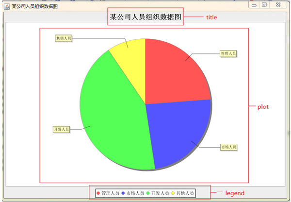
A pie chart is a circular chart divided into several parts. The arc length, angle, and area of each part are proportional to the quantity it represents. Using FusionCharts, you can create 2D and 3D charts to show the proportion of each part of the data to the whole.
Zoom and scroll graph
Zoom line charts are used to plot charts with tens of thousands of data points. You can start from the macro perspective of the data and use the zoom and scroll functions of the chart to observe the data from a micro perspective. In addition, its pin function is also very useful when comparing non-adjacent data sets.
Single Y-axis combination chart
A combination chart is a combination of two or more chart types into one chart. For example, a column chart and a line chart, both have the same units and amplitude. In a single Y-axis combination chart, all data series are plotted against the same Y-axis. For example, if you want to compare monthly sales data for the current year with sales for the same period last year, you could use a column series to show current year's sales and a line series to show last year's sales. In this case, the line chart will serve as the reference point for the column chart.
Double Y-axis combination chart
A combination chart is a combination of two or more chart types into one chart. For example, a combination of a column chart and a line chart. In a dual Y-axis combination chart, each axis has its own unit and magnitude, and each data column corresponds to only one of the axes.
stacked chart
Stacked charts are used when a data set is broken down into its components and comparisons need to be made between the data sets. For example, if you want to display the total monthly sales as a column chart, and also need to show what percentage of the total sales for the month came from products and what percentage came from services, then you need a stacked chart to help you achieve this. In short, stacked charts are suitable for comparisons between totals, but not for comparisons between each component and other columns.
Bubble charts and XY coordinate charts
Bubble charts and XY coordinate charts are suitable for charts where all axes are numerical, unlike line charts and bar charts where one axis is category and the other is numerical. Bubble charts are used to display three interdependent numerical parameters. For example: You can use bubble charts to better manage your investments by showing the relationship between your investment time, return on investment, and investment amount.
Pareto chart
Pareto charts are used to display all 2-8 questions. You can use it to isolate the key cause of a problem or identify key factors for success. For example, if you want to show that 80% of your bugs arise from 20% of your code, or that 20% of your customers generate 80% of your revenue, then a Pareto chart is perfect.
Marimekko Chart
Marimekko charts are similar to 2D stacked charts. However, in addition to plotting data by varying heights (like regular stacked plots), they also increase plotting data dimensionality by varying column widths.


Useful
Useful
Useful