1. Add trend line in Excel
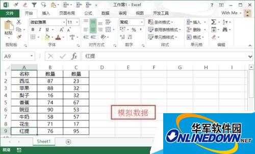
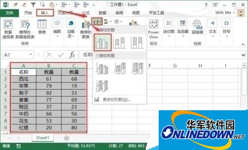
1. Prepare the test data, enter "Name" in column A, "Quantity 1" in column B, and "Quantity 2" in column C. Then fill the data in the three columns downwards.
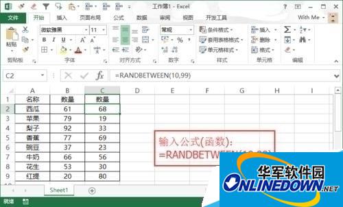
2. When inputting a quantity, you can use a random function to automatically generate numbers: RANDBETWEEN function description: Parameter 1 - starting number, parameter 2 - ending number. For example, enter the formula: =RANDBETWEEN(10,99) in cell C2 and fill it down. will generate a random integer between 10 and 99,
3. Select the simulation data and press the shortcut key "Ctrl+A" to select all, or click "Column A" and drag the selection to column C. In the top menu bar, find "Insert" and select "Bar Chart" to add a chart.
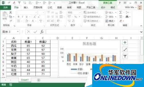
4. In the figure, the column of "Quantity 1" is blue, and the column of "Quantity 2" is orange. First, right-click the blue column and select "Add Trend Line" in the pop-up menu.
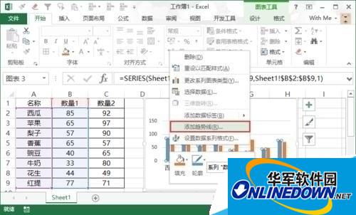
5. Similarly, right-click the orange column and use the same method to add a trend line to the orange to complete multiple trend lines. Note: If you want to add different trend lines to one graph, you can use multiple columns of the same data and then add them to the histogram.
